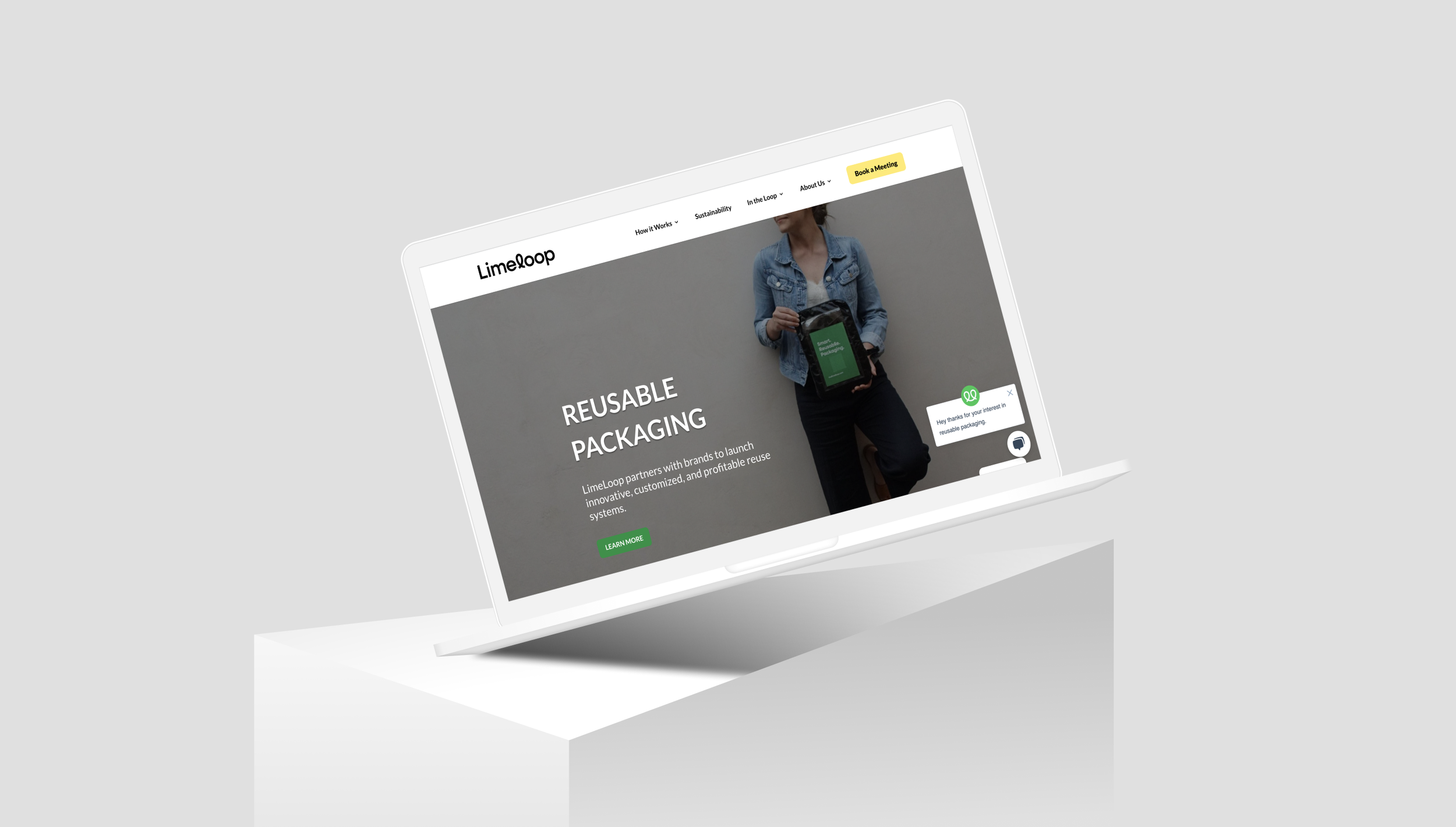
Limeloop
Company-Facing User Design Study Internship
February 2020 - April 2020
Overview
The problem
Since the beginning of mass production and shipping the world has been over flooded with the amount of wasteful trash that includes cardboard and plastic. Due to high demand for online buying, the demand for shipping materials are ramped up, and the way of retrieving and creating shipping boxes are kicked into even higher gear. The world has not consciously been aware of the impact we have made on our environment by what materials are required to assemble the shipping boxes. The result is the cutting down of billions of trees, billions of gallons of water and usage of oil, for a small quantity of cardboard boxes and plastic materials. To bridge the gap, we must steer away from a recycled based mindset and turn to a reusable method of shipping and returning.
My Role
For this project I was a UX Designer who worked in a team environment with another UX researcher. I was tasked with conducting a comprehensive redesign of their website. I worked closely with both of the startup’s co-founders to align on the design strategy and goals, and carried out certain research activities shown in the chart below. Being a client-facing role, I regularly updated the co-founder on the study’s progress and collaboratively discussed the findings and impacts with him.I worked very closely with the start up and my team and was able to see what new direction Limeloop was moving towards.
My Design Approach
Research Phase
Research Goals
As I began my time at Limeloop, I started off by meeting with the co-founder to discuss and align on the goals and outcomes their team was looking for. In this meeting we came up with a number of design features and activities that we believed would get us the desired results, and thus developed the design strategy shown in the chart above. As we begin to wander through this journey, the first step on this winding path is to conduct a competitor analysis to see what others have already done in trying to resolve this problem.
Research Activities Requested
Look over competitors
Create a gender-neutral site
Add shared assets onto new site
Design Goals and Outcomes
Included asset files from startup
Create Style Guide and Moodboard for site
Create a new website layout
Competitor Analysis
To begin the design phase, I started by conducting a competitor analysis over the list that was provided by one of the co-founders. The Limeloop team had already done preliminary market research, the co-founder and I discussed those findings to come up with our desired design characteristics. Seeing how competitors addressed relative problems I used a graded scale out of a 5 star rating to see how successful they are.
Further Defining the Problem (or “How Might We” questions)
I referenced their current market research and worked with one of the co-founders on how to create a set of HMW questions to focus on how the site can help all users concerns. From the following statements I based my potential solutions around the following objects:
How might we improve navigation throughout the website?
How might we show them the value of Limeloop?
How might we improve the sign up and onboarding flow?
How might we make the brand gender neutral?
The Ideation Phase
User Story
Next phase, I begin the ideation phase by creating user stories. This step allowed me to understand and remember the conceptual elements of designing a solution based upon the actions that users would want/expect, thus, giving me a set of functional requirements.
View enlarged version here
Information Architecture (or Sitemaps)
I have identified my core functional requirements from my user stories, and I was able to begin thinking about what specific pages and sections I would need within my solution to deliver them. As I was creating my list of pages, I used a sitemap to create an information structure - which gave me an easy-to-read blueprint for my solution to design.
The structure of the sitemap based upon a hierarchy of primary navigation tabs, which contain groupings of secondary navigation for core content/functions. This approach was used to ensure that the users would not be overwhelmed with too many options up front.
View enlarged version here
User Flows
After completing the sitemap, I went a bit further into the conceptual design process by creating user flow diagrams. Through these diagrams, I could map out how users could potentially go about completing their desired tasks by navigating through the screens of my sitemap - thus, giving me insight from their perspective.
In creating the user flow diagram, I was able to choose to focus on the “red route tasks” which will be most critical to the solution’s success:
Home Screen Navigation
User can interact with the materials and become accustom
View enlarged version here.
The Design Phase
Sketching
Following the conceptual Ideation Phase, I moved into the more practical Design Phase and started creating solution prototypes. My first prototypes were low-fidelity pencil sketches so that I could iterate through many ideas in a relatively short amount of time - focusing on the structure and overall flow.
I loaded these sketches into interactive prototyping software so I could conduct usability tests with potential users. The focus of the testing was to ensure users could complete the red route tasks:
Sign up for reusable packaging
Locate and open the news articles over Limeloop
Navigate through all the sites tabs
Results of these test were quite successful, as each participant was able to complete all the red route tasks - many of them saying that the overall flow was clear. The main issues to address were the vagueness of the sites “tabs” and the organization of all provided information onto one page.
““I really enjoy all the tabs and knowing exactly where to go in the site and being able to sign up on every available page.” ”
Wireframes
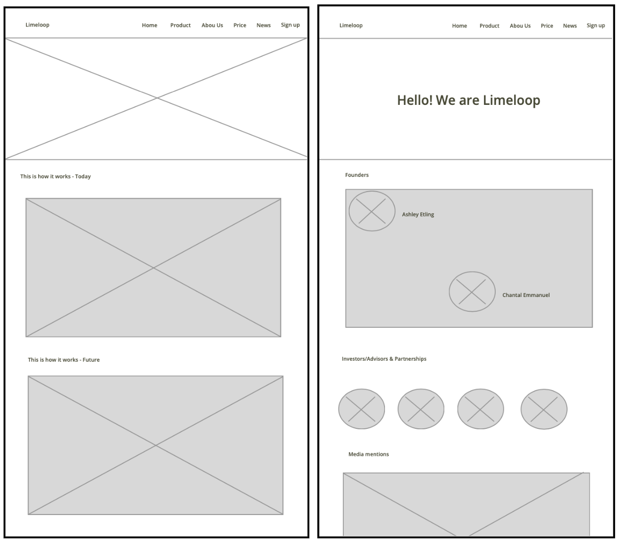
Following the successful tests of the sketches I prototyped, I started building digital wireframes - still focusing on the overall flow and structure. Creating a digital platform, I was able to use higher fidelity visuals and had more screen size to work with for my layouts - resulting in a cleaner design.
Upon completing the digital wireframes, I reviewed them with an experienced UX Designer for feedback - below are some of the biggest updates from those meetings:
Create Homepage layout - focus this page for new users, keep it simple and clear
Sign up option - needs to be available everywhere and simple for users to follow
Hi-fidelity Prototype
The first step in designing the hi-fidelity prototype was to create a style guide. Using a style guide, I made design rules to follow throughout the build to ensure consistency in user interface elements. The basis of my guide was the latest iOS design standards, as I was building for iPhone devices.
The color scheme I followed was shared within the “assets” folder from Limeloop. I added different shades of green for the new branding they are working on and added a dark grey for accent.
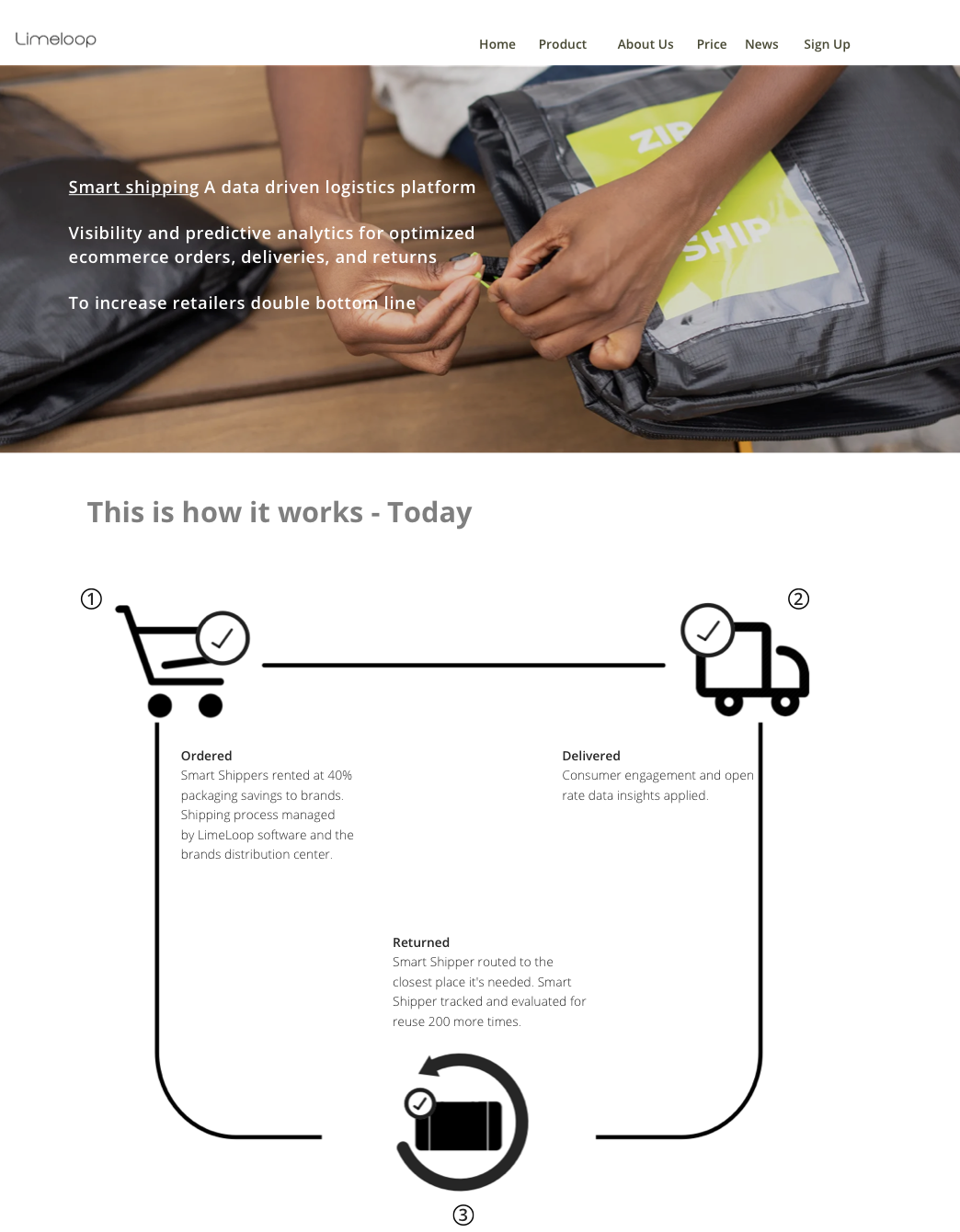
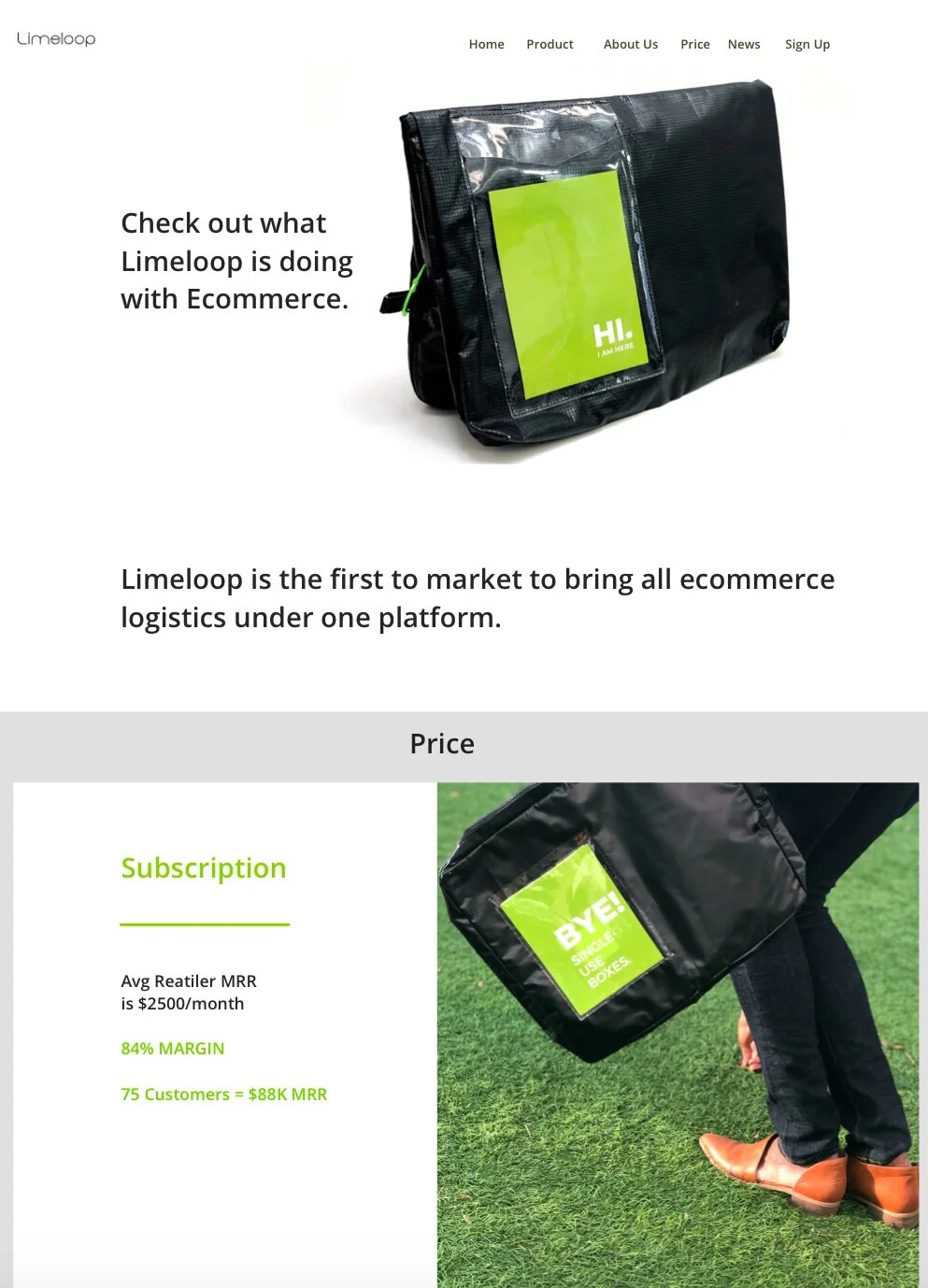
After completing the style guide, I followed the established principles into creating and building the final UI details to complete the hi-fidelity prototypes.
Results
Overall, the results of the usability testing were promising as all users were able to complete each of their critical tasks with no major issues; however, it was clear that more work needed to be done. For more specific feedback from the users, below are some of the top highlights from the usability testing interviews.
WHAT USERS LIKE:
Overall process flow is simple to navigate and understand
Home page has a good layout - easy to find information
Likes the pictures at the top to signal what tab they are in
WHAT FRUSTRATED USERS:
Having so many pieces of information and color can be overbearing
Vital pieces of information investors need to know about - Price and Ecommerce impact.
UPDATED VISUAL DESIGN
I made updates to the user interface designs after finishing the prototype and usability testing - making changes to site from the provided user feedback shown above. I also met with both co-founders to gain their insights over the changes that should be made.
View Prototype here
““This site looks so inviting that I want to look around and see more!”
”
““I love the color and branding direction of the site” - Test User 1 ”
Conclusion
Success Metrics
Based upon discussions with Limeloops co-founders and the provided research details and design approach, below are some of the top metrics that can be used to measure the sites success:
Number of website visitors
Bounce rate (how many users leave the website after only viewing one page)
Average time spent on each page
Increase/decrease in future buyers
Increase/decrease in the number of sign ups
User satisfaction (site navigation and onboarding process)
Lessons Learned
This Design Project at Limeloop has been an amazing experience in allowing me to grow and help make their site stay in the line of the brand. During my time with this project, I’ve learned a lot about how I operate as a UX Designer and working with other UX researchers. Collaborating in a team and communicating can keep everyone focused on what is expected and reach the goal we are all working towards.
Use the assets shared and converse over new ideas and directions when new branding is happening.
I was able to show others my professionalism in the materials used to design the site's new look.
